A Jury for the 2019 Book Award
11 March 2019
France Culture’s report on reading statistics in France
13 March 2019The Library is pleased to present the Culture Picks for the month of March, curated, researched and written by Library volunteer Mike Duffy.
March Culture Picks by Mike Duffy brings us three artists, three eras and three movements. All three artists were interested in science and even what some call science fiction. Two thought deeply about how we see. Two developed theories about how colors communicate. Two are credited with starting movements in art and one is the epitome of his era. In the Renaissance Leonardo da Vinci labored to represent what he saw exactly. At the end of the 19th Century, Sérusier strove to convey his feelings about what he saw in vibrant color and helped launch the Nabi movement and, perhaps, all of what we call modern art. In the middle of the 20th Century Vasarely developed a visual language of abstract symbols and colors leading the way to Op Art and beyond. What a rich feast for this season.
As always, we’ve selected books from our collection to go with the cultural visits. These books are displayed in the Members’ Lounge and available to be checked out.
Guest blogger: Mike Duffy lives in Paris following his retirement from a career in university teaching and management. He spent his first 30 years in Pennsylvania (born in Pittsburgh, college and grad school in Philadelphia), then spent a bit more than that in California where he taught accounting and finance at the Universities of California (Berkeley), Southern California and San Francisco. He can now be found in art museums, historic sites, and concert halls throughout the city.
VASARELY — SHARING FORMS
CENTRE POMPIDOU
Through 6 May 2019
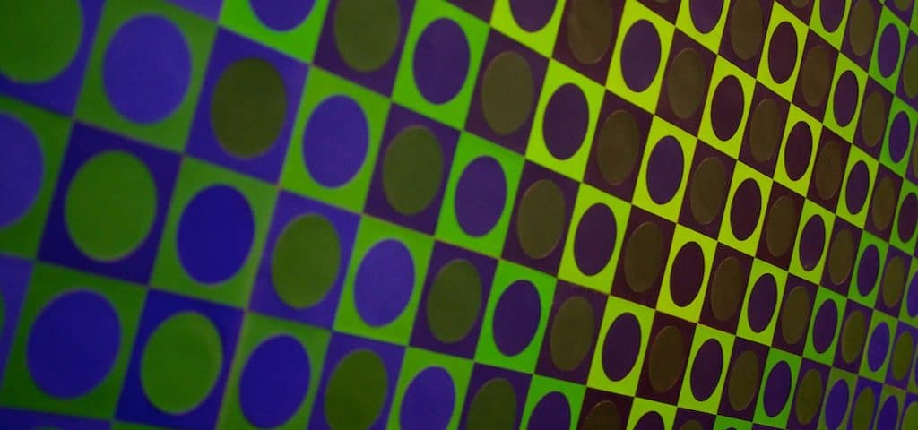
What can you say about an exhibition of 300 works by one artist who is not Picasso? In the case of Vasarely — Sharing Forms you can say, “Wow!” You can say, “What fun!” You can say, “How intriguing.” This amazing, dizzying display at the Centre Pompidou invites all of these reactions. Vasarely’s art sometimes dazzles, sometimes razzle-dazzles and sometimes is just plain fun. As was the case with several other modern artists (Warhol, for example), Vasarely studied graphic arts and designed marketing and advertising materials before turning full-time to being an artist. From that background he knew how to create with an audience in mind, how to catch the eye and how to repeat an image to make a point. All three of those insights appear throughout this exhibition which is truly a feast for the eyes.
Very early Vasarely showed an interest in visual perception. In the waving stripes of two rather fun pairs of zebras from 1936 and 1938, for example, you see the animals, but there are only waving stripes, no outlines. His 1947 Goulphar’s very flat fields of black looking like a disassembled Calder mobile and the more organic shapes in Kerrhon (1953 – 1954) soon give way, however, to geometric pieces, for a long time only in black and white, which break traditional rigid grids with pulsating bubbles and warped surfaces. Along the way there is a small 1952 painting of the town of Gordes clearly showing his awareness of Cézanne’s work with volumes and shapes followed by Cintra (1955 – 1956) which looks like a Mondrian on acid and Homage à Malévitch (1954 – 1958) in which he takes that painter’s static squares of white and black and puts them at angles to create uncertainty and movement. In fact, Vasarely seems to have drunk deeply at the early 20th Century fountains of the Russian constructivists like Malévitch (theory based geometry), the Dutch DeStijl like Mondrian and the Bauhaus like Klee (repetitive formal structures with bright colors) and the Parisian painters Kupka and Robert Delaunay (colorful, geometric works which “move”).
His own work moved into geometric abstraction, then increasingly into an abstraction of ideas and a concern for a universal form of communication. Eventually, he concentrated on designs using a limited set of forms and colors and believed that these could constitute a universal alphabet to create communication across cultures. There is a fine display of these forms and colors in one section of the exhibition including Étude 5 (Study 5, 1958 -1959/1975) and later many completed works utilizing his squares, circles, ovals and triangles. He turned to preparing formulas for works and having assistants create multiple variations in different materials. Some see this as an outsourcing which denies Vasarely the title of artist, while others see a prescient understanding of what will become computer generated art. Vasarely was interested in science throughout his life and his works are influenced by ideas about relativity and uncertainty that he gleaned from Einstein and Heisenberg who are both honored by pieces in this exhibition and his late works show a deep involvement with science fiction. He stated that “the two creative expressions of man, art and science, meet…to form an imaginary construct…” For Vasarely, his work was that imaginary construct. He was not an abstract expressionist looking deeply into his tormented soul, struggling to express his emotions. He was a rational, theory-based artist working on perception and perspective in a simplified but rich vocabulary of forms.
Over the course of a life which nearly spanned the 20th Century, Victor Vasarely (1906 – 1997) explored and exploited a myriad of materials and methods and became the progenitor of a global artistic movement which plays with optical illusions and optically complex designs. In fact, in Thames and Hudson’s Dictionary of Art Terms, it is a Vasarely piece which defines Op Art. He worked with oil and acrylic on canvas, with paper, plastic and glass, with small ceramic dishes and massive ceramic walls, in two and three dimensions, in architecture, sculpture, collage, painting, posters, and prints. He willingly let his designs be exploited on book covers, plates and dishes, in fashion ads and just about anywhere they could be used. All of these uses are on display and the very nicely presented Gallimard book covers, for example, still look fresh and inviting. Especially interesting and worth a pause in the narrow area with slide presentations are the projects in which he cooperated with architects where the use of his circles and squares and bright colors bring both wonder and fun to the middle 20th Century bare concrete structures.
Vasarely wanted to share his designs everywhere and, in the 1970s, it seemed that they were. When I mention this exhibition to people who recall his designs when they were ubiquitous, I often get the reaction, “Oh, I don’t think I like Vasarely.”, but when I talk to anyone who has seen the works at the Centre Pompidou, I only hear how much that person enjoyed the show. Whether you are in the camp which is wary of Vasarely or if you don’t know his work, you should visit Vasarely—Sharing Forms to be amazed at the chronicle of a lifetime exploring lines, color and shapes, a life of sharing the forms which fascinated this exceptionally creative artist.
Recommended books from the Library collection:
LEONARDO DA VINCI AND THE ITALIAN RENAISSANCE—DRAWINGS FROM THE COLLECTION
BEAUX-ARTS DE PARIS, CABINET DE DESSINS
Through 19 April 2019
Kicking off the celebrations of the 500th anniversary of the death of Leonardo da Vinci, Beaux-Arts de Paris presents an exceptional selection of Italian Renaissance drawings from its own collection. The 30 pieces show the range of the artists’ goals and techniques as well as the abandonment of the Middle Ages’ static view of people and the world. The genius of the age, Leonardo, is seen in four sheets of figurative and engineering work, while outstanding pieces by Rafael, Filippino Lippi and others who may not be household names impress with the vitality, the realism and the humanity which marked the last quarter of the 15th century, a time perhaps never equalled for breathtaking artistic achievement. It is surprising how well that amazing period in the history of Western art can be captured by drawings alone.
Italian Renaissance drawings appear to have had many possible uses — “appear” because there are often no records of how these individual sheets of paper were prepared, by whom or to what end. Fifteenth century painters often labored in workshops (atelier) under the direction of a master and very few of their drawings were considered finished, stand-alone works to be signed by an artist. Among the works in this exhibition are preliminary sketches for planned oil paintings or sculptures such as Leonardo’s Head of an old man, three-quarter right profile (1490s?) which might have been a preparatory drawing for The Last Supper. It shows a finely detailed, very expressive visage, a confused or uncertain person, frustrated by events as are the Apostles at the Seder table with Jesus. Page of studies for the Adoration of the Magi (1480s?), another Leonardo, shows how seemingly quick sketching can capture posture and positioning of figures for a major piece (which in its never-finished state is one of the treasures of Florence’s Uffizi Gallery). On the other hand, some of the pieces seem to be examples to be used by apprentices learning to be artists, such as the anonymous 15th century Five studies of the Virgin and Infant. Additionally, the truly great Two cloaked men (early 1480s) by Filippino Lippi illustrating the play of light and shadow on the garments’ many folds and creases may have been prepared to preserve a session with live models for later use as examples for workshop assistants. One very practical use of drawings: Leonardo’s pitching himself to one of the Dukes or Popes who ruled parts of the Italian peninsula through a demonstration of his engineering skills in exact drawings of implements of warfare.
The 30 drawings on display present an overview of the techniques that Florentine artists used to produce either highly detailed drawings with a silver pointed stylus or fluid sketches of figures with brushes or chalk. How to draw fine lines and precise details on white paper before the invention of the graphite pencil? Especially in the years 1480-1520 artists first colored paper (blue, brown, rose in this exhibition), then traced the lines using an instrument with a sharp metal point. The Rafael and Leonardo sketches of the wrinkled heads of older men translate careful observation into exact (and not idealized) pictures. Additionally, the Lippi figures in the drawing already noted and another of a seated man with two others standing show that true-to-life faces and hands could be rendered and realistic interplay of light and shadow could be illustrated in a silverpoint drawing highlighted in white. The studies of the Madonna by Rafael, of Saint Joseph and of the Deposition by Fra Bartolomeo, however, show how chalk or ink sketches could be made to experiment with positioning of figures and composition without perfecting the details of facial expression or the folds of clothing. The fluid beauty, though, of quickly drawn lines could also come from chalk alone as in Girolamo Genga’s expressive Half Nude Man (1513?) done in that red chalk often called sanguine for its blood-like tint.
In the second half of the 15th Century, Florentine artists were moving far beyond the strictures of flat, anonymous Middle Ages’ figuration to dynamic, very human portrayal of individuals rather than types. This was the Renaissance, the rebirth of the sensitivities and sensibilities of the classical era and the focus of artists was no longer only on religion or royalty. The drawings attributed to Andrea del Verrocchio or his entourage, particularly The Charity of Saint Martin (1480 – 1490), embody movement rather than the static presentations of Medieval and Byzantine predecessors. The musculature of the saint’s horse and of the beggar are robust and real. Such fascination with muscles, movement and the use of shading lines to create almost three-dimensional figures mark a number of the studio drawings in this show, many of the great paintings of the Renaissance and, particularly, the work of Verrocchio’s greatest apprentice, Leonardo.
This very fine exhibition brings you into L’École des Beaux Arts (at no charge) where you can enjoy the one-time chapel which houses interesting copies of Michelangelo works and excellent examples of Medieval sculpture as well as the grand courtyard with its classical statuary, painted frieze and lovely tile floor before entering the small dedicated space with room for only 19 people at a time to allow close examination of each of these exceptional works. This is an outstanding opportunity to enjoy a marvelous range of rare Italian Renaissance drawings.
Recommended books from the Library collection:
SERUSIER’S THE TALISMAN, A PROPHECY OF COLOR
MUSEE D’ORSAY
Through 2 June 2019
What was it about Pont-Aven in the last quarter of the 19th Century that motivated painters to work in a distinctly new way that we now recognize as modern? Was it the fresh, unspoiled scenery of Brittany unmarked by industrialization? Was it the people of the countryside still wearing regional dress? Was it the presence of churches, religious symbols, myths and stories? Maybe a bit of all of those, but mostly it was Paul Gauguin, and through Gauguin’s teaching, advice or guidance—there are many versions of the story—Paul Sérusier (1864-1927) created a small painting which sparked a revolution among young artists in Paris. Formally titled Paysage au Bois d’Amour (Landscape in the Bois d’Amour, 1888), the work was seized on by a group which met every week to share one new, daring work by each member. The small work was brought to each session as a lucky charm and named The Talisman by one member and this talisman unleashed creative spirits which led to less and less realistic painting, more and more emotional, colorful and eventually abstract art. The exhibition at the Musée D’Orsay, Sérusier’s The Talisman, a prophecy of color, pivots around this small painting to showcase Sérusier’s work as well as that of the talented group called Nabis or prophets, all extending the lessons of Paul Gauguin (1848-1903) about art as expression of the artist’s feelings and about the wonders of vibrant, rich color.
The 60 works on display put the artist at the center—that is, the artist’s feelings, reactions and beliefs—as they present highly personal views of the natural world without concern for faithful presentation of scenes or scenery. Other 19th Century painters presented magnificent mountains, billowing clouds and lakes as signs of the spirit or power or deity behind creation, but there are few traditional landscapes or mountain scenes among the work of the Nabis. There may be a sense of a dreamy spirituality and mystery in, say, Madeleine au Bois d’Amour (1888) by Émile Bernard (1868-1941), and clearly there are religious elements in works such as Le Christ vert (The Green Christ, 1890) by Maurice Denis (1870-1943) who called himself a “Christian painter”, but the cross and the figure of Jesus are green and Bernard’s sister strangely lies prone in front of trees, water and a pink ground on a different scale. While some pieces link the material and spiritual realms, in Les Pins rouges (The Red Pines, around 1894 – 1895) by Georges Lacombe (1868 – 1916) with its red-barked tall trees running to the border of picture you see the more typical a-religous approach of these painters, a-religous and using nature to express oneself. Some years later, Denis would write,”Art is no longer a visual sensation that we gather, like a photograph, as it were, of nature. No, it is a creation of our spirit, for which nature is only the occasion.” Nature is an occasion not the subject.
Bold, pure colors dominate. Séruiser, Denis and the others used color as the primary element of painting. In this initial period of excitement, color was more important than form, and composition came from arrangement of colors more than arrangement of figures. Around 1890 Édouard Vuillard (1868 – 1940) created a portrait called Le Liseur (The Reader), for example, with blotches of two shades of brown appearing as hair or hat with light and dark green areas making a jacket in front of flat pink, red and yellow planes. Denis wrote, “Remember that a picture, before being a battle horse, a female nude or some sort of anecdote, is essentially a flat surface covered with colors assembled in a certain order.” Color remained central to the work of Sérusier as he moved on to develop his own color theory (as did other 20th century artists such as Paul Klee, Wassily Kandinsky and Victor Vasarely) as illustrated by Cercle chromatique (Chromatic Circle, no date) and Dissonance chaude / Dissonance froide (Hot Dissonance / Cold Dissonance, around 1921) and like Vasarely he created sacred, cosmic geometric shapes in color fields in Tétraèdres (Tetrahedrons, 1910). In two early 20th Century works of Charles Filiger (1863-1928) featuring kaleidoscopes of colors, there is a sense that colors have life and meaning of their own. Following the Nabis, artists called Fauves (Wild Beasts) would continue the use of bold colors in ways which shocked the public, Henri Matisse would make their bold colors and black outlines his own and artists would use flat, bold color fields on canvas, paper and metal throughout the 20th Century.
The Talisman is the first thing you see in Wikipedia’s definition of synthetism, a term which describes works by, among others, Bernard, Gauguin and Sérusier. Its derivation gives it the flavor of combining elements to form something new, complex, different. The excellent paintings in Sérusier’s The Talisman, a prophecy of color give life to that meaning. They are new, complex, different from what came before and prophecies of color-filled 20th Century art.
Recommended books from the Library collection:

